Logo Design: Customize Letters To Make Meaningful Designs
How does a designer come up with logo concepts? What if you can’t find the right icon to represent your company?
If you are struggling with an icon to represent your company or brand you can always start with typography. Explore different font families that relate to the product or your brand. Then, if possible, customize/modify the text to be more unique.
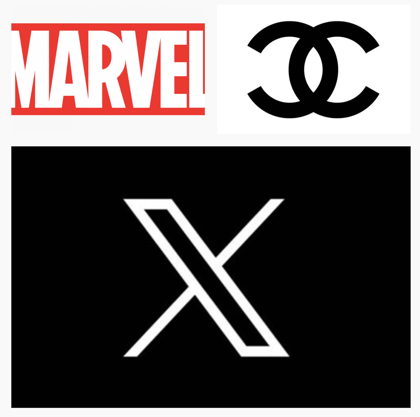
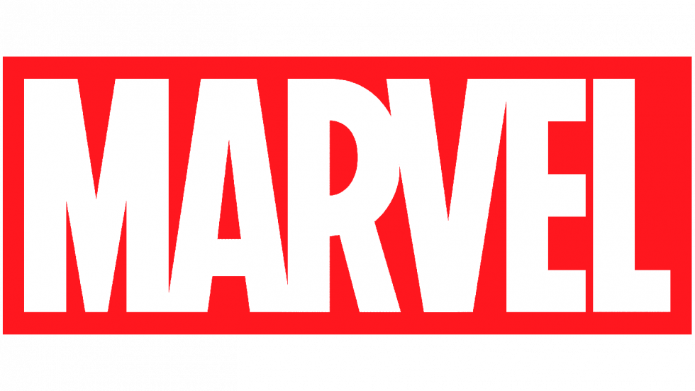
You can often “cut” into letters to create meaningful shapes, or merge letters to create a unique design. Take for example the logos below. Marvel uses capital letters for a very powerful statement, but notice how the letters are merged (always use letter spacing/kerning) to create one object (Ref. Gestalt Principles). If the letters were not merged together you would just have text and NOT a logo.
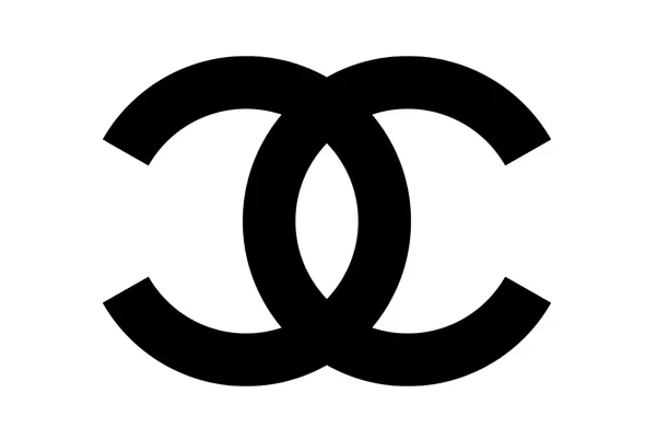
What about the Gucci logo? Notice how it is just the letter “c” duplicated and flipped. Then, the two letters are merged to create what resembles a chain. The merging also creates nice negative space and a perfect rounded or square-shaped logo which the viewer’s eye can easily revolve around.
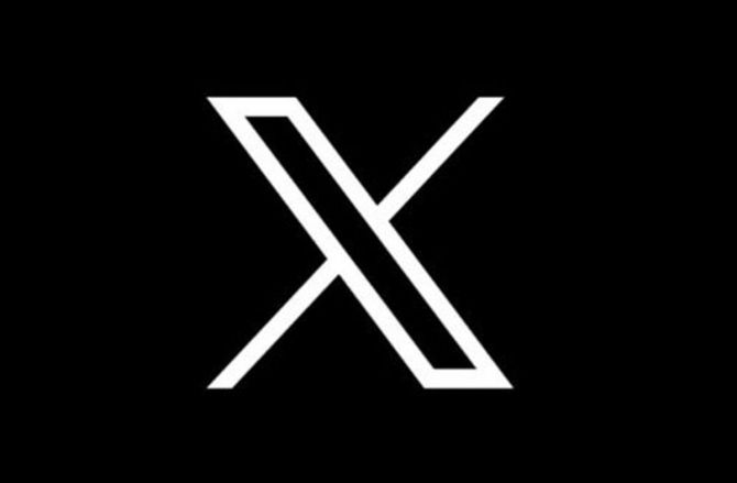
And, take a look at the X logo (that replaced Twitter). It is not just an X. It is an X that has been modified by making the one of the cross bars wider and outlined. It is interesting, however, that the skinny bar does not fit into the negative shape of the front bar (often a technique used to create a relationship between shapes). It’s possible the designers wanted the front bar to retain more weight. This is something worth examining further in a future post.


Take a look at this YouTube video that explores adjusting the spacing between letters and shapes to create more effective logos.
