Visual Hierarchy In Graphic Design
Visual hierarchy can be defined by the arrangement of elements in order of importance to guide a viewer’s eye through content to create an organized design experience. You can set the priority of information by using visual weights, and by creating a “scanning pattern” (such as F-patterns or Z-patterns) to guide the viewer.
Note: Keep in mind other cultures than Western may use different scanning patterns, For example, Japanese designs use top-to-bottom, right-to-left patterns.
How do you express visual hierarchy (or, the “priority of information”)? You can do it with scale (most common), color, placement, and other design principles.
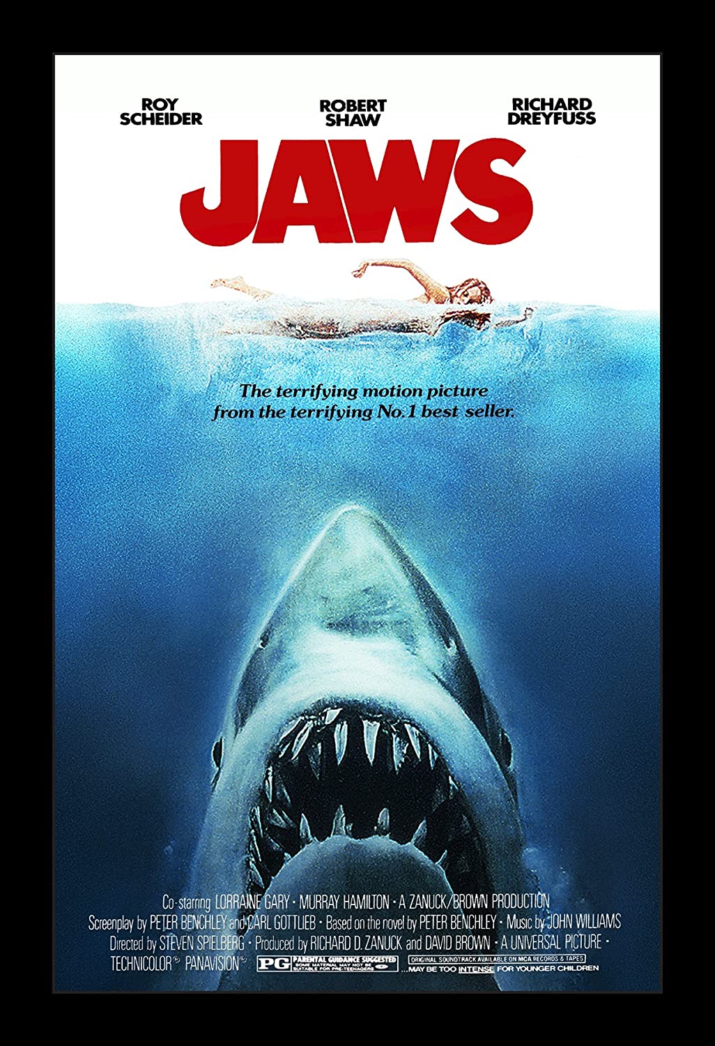
See the example of the vintage Jaws poster. What is the first thing you see? JAWS, in most cases. Why? Because it is red and big. What is the second thing you see? The shark? Now notice how the shark is pointing up to the both the title and the swimmer. The shark acts both as a dominant visual element and guide for the viewer. The shark is telling you its name!
Now, what would happen if the shark was red also? You would never stop looking at it. Big and red is the ultimate way to get a viewer’s attention. So, try to avoid that much attention to a single element unless you really need to.
Now look at the other elements in the poster. The actors are the third most important element, followed by the tagline “The terrifying motion picture…” which is semi-translucent because of the water.
Movie posters generally have the following order of importance:
- Title
- Actor(s)
- Release Date
- Studio
or depending on the actor(s) could be:
- Actor(s)
- Title
- Release Date
- Studio
There also may be taglines, full movie credits (the condensed text at the bottom), and rating.